If you’ve ever handed out a Halloween party invite that felt more like a supermarket flyer than a warning, the fix is usually four things: a dark limited palette, a typeface that looks old, texture that looks damaged, and wording that leaves out just enough. Learning how to make Halloween party invitations look creepy is mostly a matter of restraint. You are not trying to print the most frightening image you can find; you are trying to build tension in about five seconds of looking.
This guide works whether you are printing at home on cardstock, writing cards by hand, or sending a digital invite. Budget about 45 minutes per 10 printed cards once you have the supplies down, and no specialist craft skill.
Table of Contents
- What You Need
- The basics
- Optional finishing tools
- Step-by-Step: How to Make Halloween Party Invitations Look Creepy
- Choose a Creepy Visual Direction
- Build a Dark, High-Contrast Layout
- Add Distressed Paper and Worn-Out Edges
- Choose Eerie Fonts and Wording
- Finish with Haunted Details
- Proof the Details and Send the Invitations
- Common Mistakes
- Frequently Asked Questions
- What colors make Halloween invitations look creepy?
- How can I make plain cardstock look old and haunted?
- What fonts are best for creepy but readable invitations?
- Can I make creepy Halloween invitations without a printer?
- How do I make digital Halloween invitations look unsettling?
- Should creepy invitations include blood or gore effects?
What You Need
You can do this with paper, ink and a pair of scissors, but a few extras make the difference between spooky and store-bought.
The basics
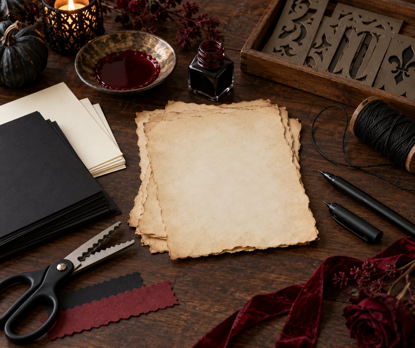
- Paper: black, charcoal, ivory or bone cardstock, 160 to 300 gsm (roughly 4×6 inches is the standard invitation size, which fits a business envelope).
- A second paper for texture: plain printer paper, baking paper, coffee-filter paper, or cheap parchment for tearing and staining.
- Ink: black matte ink or a black gel pen for the base, plus one accent colour (dark red, rust, dried-blood brown, or bone white).
- Fonts: at least two, one for atmosphere and one for the practical details.
- Scissors or craft knife for torn and die-cut edges, plus a ruler if you want a clean 4×6 trim.
Optional finishing tools
- Strong black tea and a wide shallow tray, for staining paper.
- Old toothbrush and diluted black ink, for speckles and splatter.
- Eraser pencil or scraper for scratched-out areas, plus a fine nail file for feathering edges.
- Wax seal stamp and a sealing wand, or black waxed twine and a small hole punch.
- Black envelope liners, printed on regular paper at full scale.
- Corner rounder, bone folder, or a spoon handle for creasing.
- Matte laminate sheets, if you want the invite to survive handling and mailing.
Design software is optional too. Canva and Adobe Express both have free tiers with gothic and typewriter fonts built in, and GIMP is a free option if you already know it. The craft techniques below work with nothing more than a printer and a pair of hands.
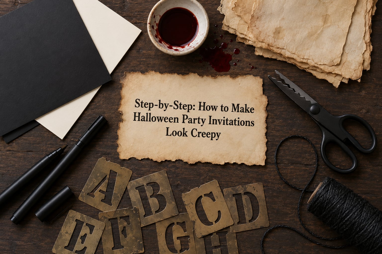
Step-by-Step: How to Make Halloween Party Invitations Look Creepy
Choose a Creepy Visual Direction
Pick one visual story before you open a design tool, because every later choice depends on it. Victorian mourning, 1980s slasher poster, haunted-house estate sale, cosmic horror, and gothic romance each have their own colours, imagery and wording, and mixing them is what makes an invite read as cheap rather than creepy.
Write the direction in one line before you design. Something like “murder mystery dinner party set in 1927, damask wallpaper and typewriter type” tells you instantly to use deep burgundy and black, an engraved serif, and copy that speaks in second person.
Match the tier to your crowd. A trick-or-treat party for five-year-olds lives in the same visual family but stays playful, with fewer shadows and no blood. A haunted-house night for teens gets more decay and less gore, and an adults-only event can go as ominous as you like, since the people receiving it have opted in.
Build a Dark, High-Contrast Layout
A creepy invitation uses two to four colours, one of them black or near-black, and it keeps the practical details in a lighter ink so they stay readable.
| Palette | Hex codes | Mood | Best for |
|---|---|---|---|
| Bone and Ink | #0A0A0A, #E8E0D0, #6B1C1C | Quiet, old, restrained | Murder mystery, adult dinner party |
| Charcoal and Burgundy | #1C1C1E, #4A0E1E, #C9B79C | Velvet gothic | Gothic romance, haunted mansion |
| Ash and Rust | #2B2B2B, #8C3B1E, #D6C7A1 | Burnt, industrial | Slasher theme, warehouse party |
| Bone, Black and Dried Blood | #111111, #EFE9DC, #6E0F12 | Occult, ritual | Adults-only, occult themed |
| Purple Haze | #241B2F, #5B3E73, #E6E1E9 | Strange and supernatural | Cosmic horror, teen party |
Layout matters more than imagery. Centre everything on one axis, leave wider gaps around the party name than around the date, and let the practical block sit in a calm rectangle with even line spacing. Uneven spacing in the atmosphere elements plus even spacing in the details is what makes an invite feel handmade rather than broken.
Keep the whole design inside a safe margin of about 0.25 inches on every edge. Anything closer prints badly on a home printer and gets cropped by the 4×6 template.
Add Distressed Paper and Worn-Out Edges
Distressed paper is the single biggest jump from new card to haunted artefact, and every version of it is cheap. Steep torn edges with hot tea, scratch out ink with an eraser pencil, and feather borders with a file or scraper so no two cards match.
- Tea staining: brew strong black tea, cool it, lay the paper in the liquid for two to five minutes, then blot rather than rub. Longer soaking means darker edges and a soft mottled tone across the sheet.
- Baking paper transfer: scribble over a torn edge with a soft pencil or charcoal onto baking paper, sandwich it under the card and press firmly. The texture transfers onto the card in about ten seconds.
- Torn edges: dampen the edge slightly, then pull the paper against itself rather than cutting with scissors. Scissors give you neat scallops, which reads as crafty; tearing reads as damaged.
- Burning: hold the edge over a candle or use a woodburner to singe it. Work outdoors, on a metal sheet, and keep a clear bucket nearby. This is the only step on the list with a real fire hazard.
- Speckles and smudges: flick diluted black ink with an old toothbrush, or drag a thumb through a fresh ink patch for a partial fingerprint.
- Uneven ink coverage: print on cheap paper first, then trace the design onto cardstock with a pen so the ink sits in the grain instead of on a smooth plastic coating.
Do one of these, not all six. Heavy distressing plus gothic type plus blood drips is the recipe for the cheap look most hosts complain about.
Choose Eerie Fonts and Wording
Pair one antique or handwritten face for atmosphere with one plain, readable face for the date, time and address. If a guest squints at your invite and cannot find the location, the design has failed.
- Victorian and engraved serifs such as Playfair Display, Cormorant Garamond or Cinzel for a period feel.
- Typewriter faces such as Special Elite or Courier Prime for a found-document or police-file look.
- Gothic blackletter for a single word such as “Beware” or “Tonight”, never for the whole card, because blackletter is the fastest way to make details unreadable.
- Handwritten or scratchy faces such as Caveat, Creepster or Anything But Print for a personal note.
Wording does as much work as type. Keep it second person, keep it short, and keep the mystery in the details rather than in the logistics.
- “You are cordially invited to a night you may not forget.”
- “Come to the house on Elm Street. Bring a candle. Bring a friend you trust.”
- “Dress dark. Arrive quietly. Details of the evening will be explained when you get here.”
- “Costumes encouraged. Costumes non-negotiable.”
- “RSVP by the 20th. We need a headcount for the cauldron.”
- “Adults only. The kids are staying home with the babysitter and the dog.”
Always include the date, start time, address, RSVP deadline, costume line and whether it is adults only. Atmosphere goes on top; logistics go underneath in a plain font.
Finish with Haunted Details
The last layer is what people mention a week later, and it usually costs almost nothing.
- Wax seal: a black or deep burgundy seal stamped over a folded flap. A length of black waxed twine tied in a loose knot does the same job for less effort.
- Black envelope liner: print a spider web or a repeated damask pattern on plain paper, cut it to the liner size and glue it in. This is the moment the invite goes from flat card to object.
- Faux cobwebs: stretch a dry cotton ball or teased-out wool along one corner, or glue printed web imagery into a corner and dust it with glitter for a frosted look.
- Die-cut silhouette: cut bats, crows or a bare tree branch out of black paper and mount them so they hang off the card edge.
- Interactive detail: a small brass key on the twine, a bookmark that doubles as an RSVP card, or a torn-off reply stub at the bottom.
- Matte laminate: a matte finish removes the glare that makes dark cards look like plastic.
Give digital invites the same treatment. A five to eight second loop with a slow fade, a low ambient sound, faint grain and one line of copy does more for tension than a pumpkin clip-art animation does for fun. Hold the reveal of the date until the last two seconds.
Proof the Details and Send the Invitations
Read the invite from two metres away, then from arm’s length. If the date and address are only readable up close, the contrast is too low and you need to lighten the detail ink.
- Check date, time, address, RSVP deadline and spelling twice.
- Print one test card on the actual stock before printing the whole batch.
- Avoid full-bleed black on home printers, which streak and band; a black border with a margin prints cleanly.
- Let ink dry a few minutes before stacking, or the backs pick up ink.
- Mail flat in a 4×6 or business envelope rather than folding, so corners stay sharp and torn edges survive.
- Send about four weeks ahead for an October 31 date, and two to three weeks for any other date.
Common Mistakes
Almost every invite that lands in the cheesy pile fails on one of these, and each has a quick fix.
- Cartoon ghosts and clip-art bats. They read as a school party, not a haunting. Replace them with a vintage engraving, a silhouette, or a photo you shot yourself.
- Everything in a dark colour. Black on black details are unreadable. Put the practical information in bone or cream.
- Muddy colours. Deep green on black turns to sludge. Pick one dark, one light and one accent and stop there.
- Too many effects. Blood drips, torn edges, cobwebs, skulls and a distressed font all compete. Choose two.
- Cheap fonts. Anything with a drop shadow, a gradient or a bevel looks like it came from 2003. Use plain type and let the paper do the work.
- Too much mystery in the logistics. Hidden details are frustrating, not spooky. Keep the atmosphere in the headline and the facts clean underneath.
- Handwriting over neatness. Slightly uneven is good, illegible is not. Sketch the wording in pencil first.
Frequently Asked Questions
What colors make Halloween invitations look creepy?
Dark, limited palettes read as creepy because they suggest decay rather than celebration. Black or charcoal with one light neutral, plus a single dark red, rust or bone accent, is the reliable combination. Avoid bright orange and green, which signal fun. Keep to three or four colours total so the eye lands on the text first and the atmosphere second.
How can I make plain cardstock look old and haunted?
Brew strong black tea, let it cool, and soak the cardstock for two to five minutes, then blot the surface rather than rubbing it. Longer soaking gives darker, uneven edges. For texture, transfer a scribbled charcoal edge onto the card with baking paper and a firm press, then feather the border with a file so no two cards match.
What fonts are best for creepy but readable invitations?
Use two fonts: one antique or handwritten face for the atmosphere, and one plain sans serif or serif for the date, time and address. Engraved serifs like Playfair Display or Cinzel, typewriter faces like Special Elite, and scratchy scripts like Caveat all work. Reserve blackletter for a single word, since long passages in gothic type are hard to read.
Can I make creepy Halloween invitations without a printer?
Yes. Write on pre-coloured cardstock with a black gel pen, use stencils or letter stencils for the party name, and add torn paper, tea stains, twine and a wax seal for texture. Another option is a rubber stamp on kraft or black card, which gives you the same distressed look on every card with far less setup.
How do I make digital Halloween invitations look unsettling?
Use motion sparingly: a five to eight second loop, a slow fade, faint film grain and low ambient audio work better than a jump scare. Hold the date and location back until the last two seconds, keep the palette dark, and set the message in a typewriter face over a still image. Silence and delay create dread that instant effects destroy.
Should creepy invitations include blood or gore effects?
Mostly no. Deep red drips and spatter read as menacing and still let everyone read the details, while realistic gore tends to look like a cheap costume prop and can be off-putting for mixed-age and family guests. For an adults-only event, restrained blood accents work fine. For kids, use pumpkins, ghosts and cobwebs with no red at all.
Start with the paper, not the clip art. Pick one palette from the table, stain a single sheet of cardstock with tea, and write the wording in two fonts. Those three decisions do more for a creepy Halloween party invitation than any amount of added decoration.
Once you know which direction works, the same colours and type will carry through the rest of your Halloween decor, and the whole night will look deliberate rather than assembled.